Viz That Saved Lives
In 1854 over 500 people died in one London neighborhood in only ten days.
When no one had the answer as to how the outbreak began, Dr. John Snow started with a question and solved the mystery using data visualization. His long held theory, though contrary to prevailing beliefs, was that Cholera was spread by water and not through the air. He wasn’t sure how to prove it, especially when he had the miasma theory to disprove, but he succeeded by creating a map detailing each death. He was successful even without the help of the advanced data analysis tools we have today.
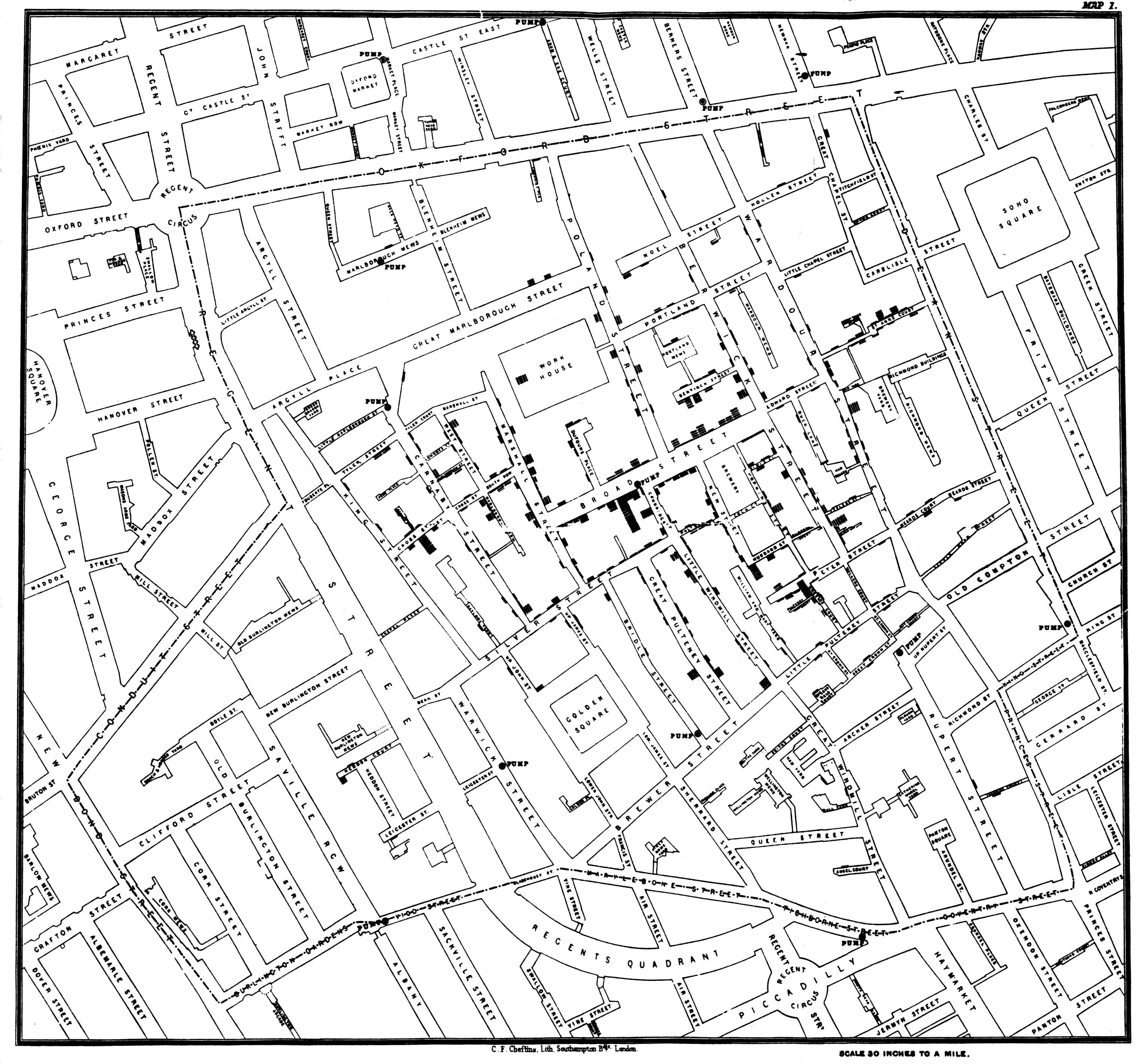
What did Dr. Snow have: A deadly epidemic Courage A theory Paper and pencil With these, Snow went door to door, yes in person, to the heart of the Cholera outbreak and began compiling a list of deaths by address. That was conviction, he didn't believe in the airborne theory so of course he wasn't compelled to avoid the area. He sketched the mortality data of each household on a map of the neighborhood with corresponding water pumps and, as usual, one viz was worth a thousand words. The bars on the map relate number of deaths by address with the red circles marking each water pump. Once the data was visualized it was much easier to see what was at the center of the deaths. Of course there were outliers, as with any data set, but these further proved that the Broad Street pump was the source. One such case was a house too far from Broad to be likely that they were drawing water from it. It was discovered that a woman who had moved from the Broad Street area was receiving regular deliveries of the Broad Street pump water because she had preferred its flavor over that of a closer pump. Her and a visiting niece died from the disease. Another outlier was found in a brewery that was very near the pump. None of the workers there were infected and what spared them was their daily stipend of ale provided by their employer which replaced any water they would have consumed.
John Snow's map led to the removal of the Broad Street pump handle the day after he presented it. It was later proven that the Broad Street well had been contaminated from the waste of a nearby house where the outbreak began. Only another 116 cases were reported after the handle removal and Snow was able to slowly convince the public and leading authorities that Cholera was spread through ingestion of infected water and not through the air. This would ultimately lead to the correction of the city's infrastructure and save countless lives into the future.
Great results like these can only come from asking questions and finding answers in the data that you have. After you have your answers, you need a great viz to convince the audience with. John Snow mastered this art with his map visualization. Check out a modern viz of the outbreak here. This was adapted from Tim Deak's original.
What is your #dataquestion?